
In this week's lesson, it was emphasized that complicated structures look intimidating when seen as a whole, but when broken down, we can see that they are made up of a bunch of simple shapes.
We were asked to look at the artist Sparth and choose an interesting design from his drawings. I noticed trends on how he composed his work and different ways he constructed buildings. Below are some images that I was able to take ideas from.


What I found was that each image had structures seen in the distance, with something in the foreground to emphasize the scale of what was being seen. The environment itself is set in a way that helps with movement in each piece, making it even more visually interesting.
The aim of the lesson was to mash up a bunch of shapes to make an interesting structure. I randomly came across a picture of what looked like to be some sort of air conditioner (although I could be mistaken) but I found the shape of it to be interesting and thought it would be a cool design for a building reminiscent to Sparth's structures. I then took a bunch of cubes and cylinders and put them together to make what looked like a factory. I added bridges and doorways for tiny people to walk through.

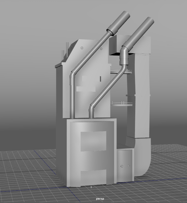
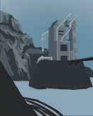
After modeling the factory, I wanted to make some sort of rough environment layout to set up what kind of angle I wanted for the building. Since Sparth's buildings tended to be elevated, I decided to have the factory set on some sort of mountain. I wanted to add more pipe elements so I attached some to the side and back of the building, which gave me the idea of there being some sort of waterfall behind the factory, flowing over the mountains. Now the questionable air conditioning building looks more like some sort of water plant, drawing water from the waterfall (that will later be seen more clearly in the illustration).
I also later added a bridge and a car to help emphasize the scale of the building while also leaving some room in the foreground for me to add stuff in the final drawing.
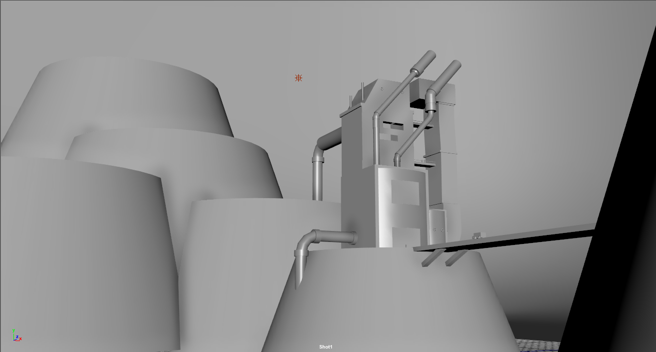
Once I was satisfied with the composition of the building, I played with the lighting a bit to get an idea of where shadows would fall. In the outliner, it can be seen that I grouped elements together for the sake of organization (no one likes a messy outliner).


No comments:
Post a Comment