Sunday, August 1, 2021

Research Project

The Story with Story Beats

For my research project, I decided to dive into illustrating story beats (a.k.a. story moments). Story beats serve the purpose of showing a pivotal scene that helps move the story. Each story beat should convey the emotion, color, and ideal lighting scenario.

Step 1: Create your composition

Many artists draw out different compositions when setting up a scene. Having many iterations helps with finding the layout that best shows the purpose of the scene.

For example, these are 3 different shots that I considered for Beat 01. The most important thing for this beat was to show Rapunzel's anxiety when it comes to the thought of leaving the tower.


The first two shots showed the tower in a sort of menacing angle, but Rapunzel got lost in the shot. I ended up going with Shot 03 since that did a good job of showing Rapunzel's expression as she looked down from the tower.

Step 2: Start sketching

Since I blocked my scene out in Maya, that sped up the sketching stage a lot for me. After rendering, I would go into Photoshop and sketch the characters out on top of the render. In this stage, I really try to push the emotion and body language of the characters. Its good to have all the wild changes now rather than later.


Step 3: Block out with color

After my characters are sketched out, I start laying out colors on different layers. I also make sure to name my layers to help with organization (highly recommend).


Step 4: Render background

Once I have all my colors, I'll start painting and fully rendering out the background and characters. I personally like starting with the background first to knock that out of the way as fast as I can. The focus should be on the characters so its fine if the background isn't perfect.


Step 5: Render characters

Once the background is done, its time to start rendering out the characters. I have every color set to a different layer (labeled) so I can just create a clipping mask and paint through there to not paint on anything I don't want. I don't worry about lighting too much here since that will be achieved in a later stage.


Step 6: Color any outlines

One of the most important steps in my opinion, is coloring the black outlines characters/props were drawn with. This really helps give depth to everything, making them look less flat.


Step 7: Let there be light

The last step, lighting! I use multiply layers for shadow and an overlay layer for light. I try to use the lighting to bring the focus to where I want it to be. In this stage I will also decide if I want to add any effects, like a gaussian blur, to push back the background some more. I will usually keep tweaking the lighting until it gives off the intended mood.


Portfolio 03 Week 03

Story Beats Part 03

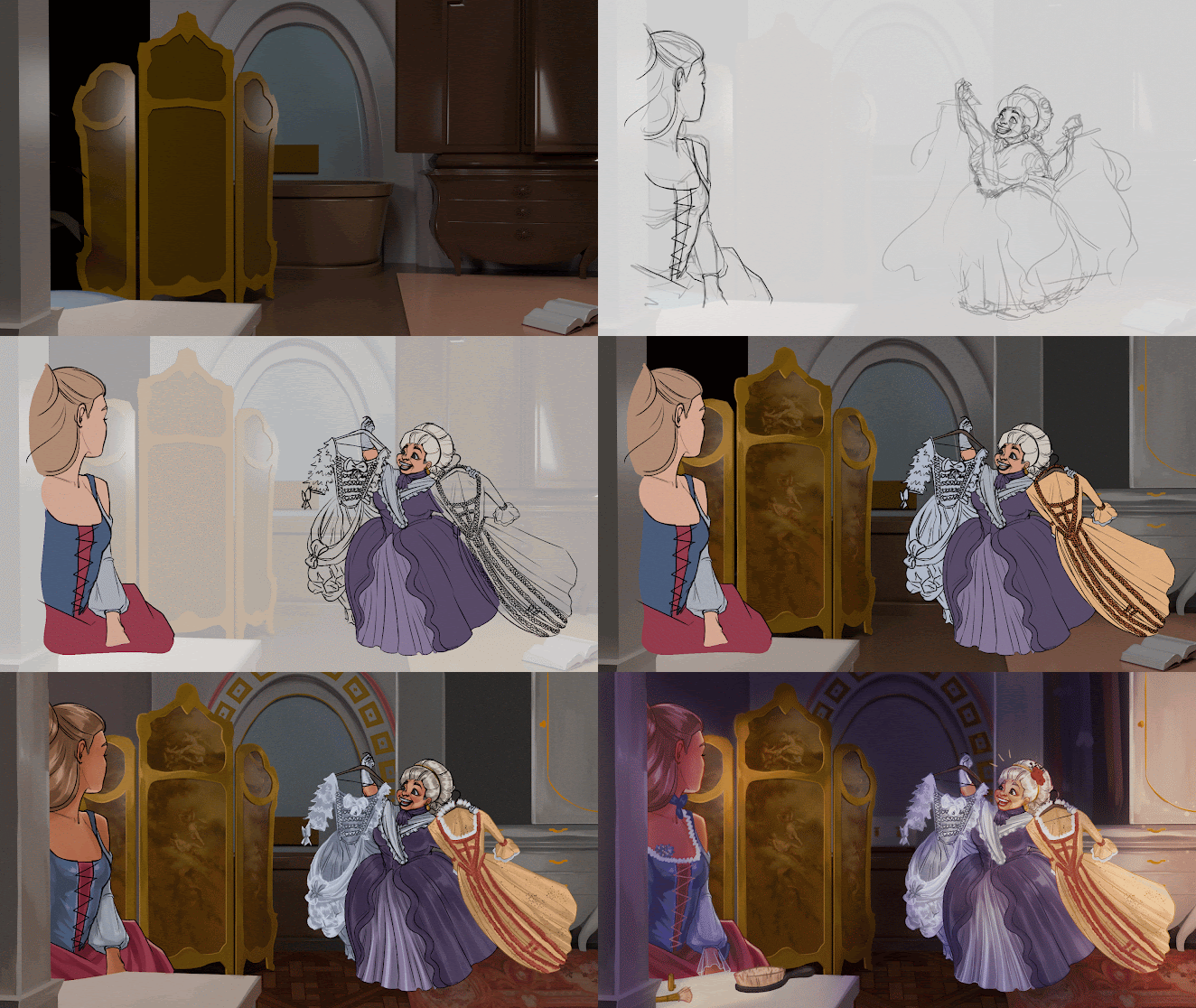
This week, I focused on beat 03, which is the audience seeing how excited Gothel is to help Rapunzel get ready for the ball. She is ecstatic because it would be a huge step for Rapunzel. My process can be seen below.

Here is the final illustration.

I have mixed feelings with how this came out. I don't really like how I did the lighting so I will probably redo that in time for industry review.

Sunday, July 25, 2021

Portfolio 03 Week 02

Story Beats Part 02

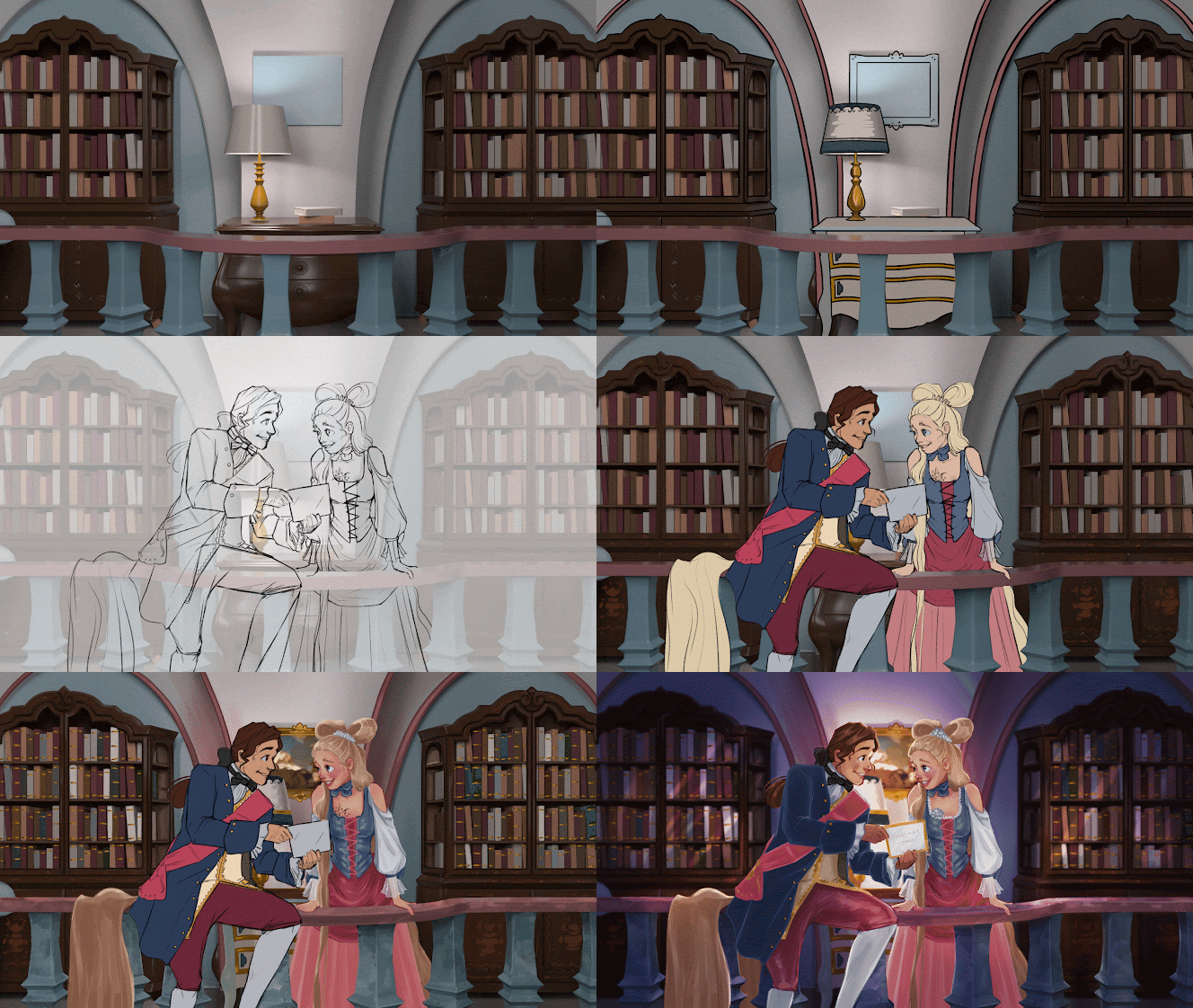
This week I started on my second story beat. For this scene, I wanted to show Prince Luca giving Rapunzel the invitation to the ball, with Prince Luca being very excited and Rapunzel having to be convinced a little more. Below is the process being done in photoshop. I'm still looking for software to do a timelapse of my drawing process but in the meantime, I'll be compiling it in Premiere Pro as a gif.


This is where I am at so far, I am planning on finishing it by the end of the day Monday. Time wasn't on my side this week so this submission suffered from that. 


UPDATE

Here is the finished process and final illustration.


Friday, July 23, 2021

Sprint #5 Delivery

For this delivery, I tweaked the lighting in the tower and fixed the material of the shelves so that they didn't look so dark compared to everything else.


I also worked on the texture issue with the tower. I fixed the UV's but am still having issues with the normals in substance painter. I'll keep playing around with it to find the problem.


Sunday, July 18, 2021

Portfolio 03 Week 01

Story Beat 01

For this portfolio sprint, I will be illustrating story beats - one each week. My research will be seeing how these sorts of illustrations are done for films. I will also be showing my process throughout. For future presentations, I will have a timelapse video of me working. This week I dived right into the assignment so I forgot to record myself, therefore I will be showing images for this week.

For the first story beat, I wanted to introduce Rapunzel and her problem of being unable to leave her tower due to her anxiety, leaving her distraught. I've seen people experiment with different compositions before settling on one, so here are the 3 shots I experimented with. I decided to go with the 3rd one since we get a good view of Rapunzel's face, which is the most important part.


For these shots I tried using camera techniques for how I wanted the audience to feel. I tilted the camera for an attempt of giving a sense of uneasiness.

After rendering out my frame, I went into photoshop and sketched in Rapunzel. I put the mannequin in to help with foreshortening and placement. I thought that having her hand on the rail would make the illustration more visually interesting.


It seems that for film, story beats offer a way to show how the camera, lighting, and mood of the scene would be. Since we're seeing Rapunzel in a sad state over something she thinks she can't change, I wanted to have the shadow cover most of her face seen by the audience. Since the light is coming more from the back, I liked the idea of Rapunzel being giving a nice rim light that would help her pop even more.

In terms of process, my work for this illustration was anything but organized so that is something I'm going to be working on in the next story beat.

Sunday, July 11, 2021

Portfolio 02 Week 04

Environment Part 03

This week, since environment concepts were wrapped up, I focused on tweaking some of the portfolio pieces I have made thus far. I tweaked things based off of different critiques I have gotten. Here are the before and after pics.

Tower Interior

I got feedback that the gate shadow was too harsh and that the stair shadow should be darker.

Tower Exterior


The birds were too bright in the first iteration so I put a shadow towards the bottom to make them less distracting, which in turn helps keep the viewer's attention on the tower. I also added some detail to the top of the tower that I had initially forgotten to do.

Prince Luca


Prince Luca's expressions are now more welcoming than before. He seems more friendly and less stoic.

Character Lineup


In the character lineup, I updated Prince Luca, and adjusted Frau Gothel's size to be smaller. I also made some changes to Frau Gothel's skirt because I didn't like my initial rendering of it. Lastly, I included a background to help ground the characters and not have them floating.

Sprint #4 Delivery

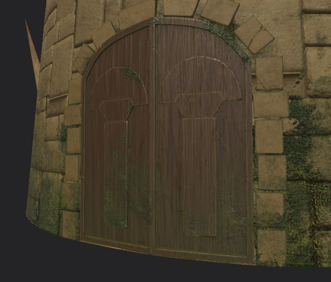
For this sprint, I made a repeatable brick texture for the tower that resembled the other rocks in the scene more. Also adjusted the coloring so that it wouldn't look so dark. I also went ahead and gave the wooden doors more of a realistic wood grain texture to match texture detail compared to Pedro's door knockers.

Repeatable Texture


New Tower Texture


New Door Texture